Color-Coordinating House and Garden
This is an excerpt from the Book called “Homescaping“ by Anne Halpin. Continue reading to learn more about Color-Coordinating House and Garden, thanks to the author.
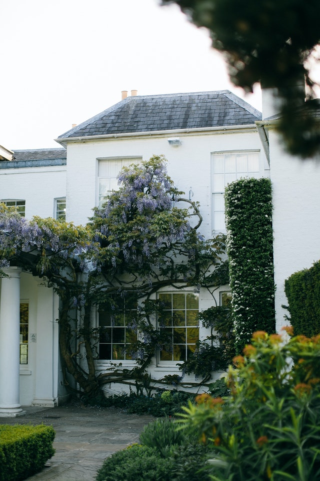
When you’ve decided on a stylistic direction for your garden and laid out basic structural plans for the locations, shapes, and dimensions of beds, borders, and other plantings, it’s time to consider color. In this chapter, we’ll look at how to work with color and how to relate the colors of the garden to the colors of the house exterior.
There are all sorts of ways to coordinate the colors in your garden with the colors you choose for both the exterior and interior of your house. You can use colors to echo, or repeat, from house to garden, or to harmonize with one another. Or, you can juxtapose colors that contrast and intensify when you place them in proximity to each other.
Ways to Work with Color
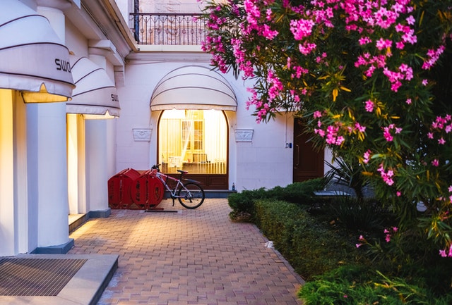
You can approach color choices for your garden in a number of different ways. You can, for instance, design your garden so that some of its colors echo or pick up colors from your house. The colors in your garden can harmonize with the colors of the house. Either of these approaches can work if you take some time to think about your color possibilities.
As you think about potential color schemes for your garden, consider the way you personally respond to color, and the kinds of colors you like in other areas of your life, such as your clothes and the interior décor of your home. Do you generally prefer bright, warm reds, oranges, and yellows; or cool, peaceful blues, greens, and purples? Are you drawn to subtle, harmonious blends of colors or to lively, contrasting mixes? Rich, deep tones or soft pastels? Do you like the serenity and cleanness of white instead of other colors?
Always remember that your garden should please you, first and foremost. Use whatever colors you like to look at. Although a well-designed landscape will add significantly to the value of your home, it should also reflect your personality. The design of your landscape should not be strictly a business decision. The true value of a garden resides in the way it speaks to your soul. If you don’t like or respond to the colors and plants in your garden, there’s little point in having one. You might as well just put in some hedges and foundation shrubs and call it a day. But if you are taking the time to read this book, you undoubtedly already appreciate how beautiful and satisfying a thoughtfully executed garden can be. The best gardens reflect the tastes and sensibilities of their owners just as surely as do the furnishings and decorative objects inside the home.
Qualities of Colors
Color theory is complex, and it can take years of study to fully understand it. But there are guidelines you can follow in mixing and matching colors to arrive at pleasing combinations. It helps to understand some basic properties of color.
First of all, colors are not simply colors. What most of us think of as “colors” are more correctly called hues. A hue is pure color-red, yellow, blue, orange -as generated by a particular wavelength of light and perceived by our eyes and brains. Hue is the first aspect of color to consider. Another is the color’s value-its lightness or darkness. Value is altered by adding white to the hue to lighten it (the resulting colors are called tints), or by adding black to darken it (these colors are called shades). For example, adding white to red creates pink. The amount of white you add determines the lightness of the pink. Adding black to the red gives you deep maroon shades. The third aspect of color is intensity –the brightness or dullness of the color. Intensity is a result of the color’s saturation- how much of the color is present.
All artists are familiar with these terms, but it’s helpful for gardeners to know them, too. Choosing flowers of different values and intensities brings more variety and interest to the garden, and being sensitive to value and intensity can make the difference between colors that fight one another and colors that create a pleasing contrast or harmony.
The Psychological Dimensions of Color
In addition to its visual qualities, each color of the visible spectrum has its own emotional and psychological qualities, which may determine, in part, which colors appeal to different people. Colors provoke responses in us, and you can use these responses to add an extra dimension to your garden.
Blue creates a peaceful, restful feeling. This color of the sea and the sky calms us and makes us feel cool. A blue garden seems somehow cool even in hot sun. Blue flowers and foliage can create the feeling of an island of serenity, especially around a small pool or fountain, or in a seating area.
Purples and violets possess a sense of mystery; these deep, rich tones appear to soften and recede in the distance, and they appear blurred and dark and misty when seen from across the lawn. Purple is also impressive and majesterial, the color of royalty. Deep purples look luxuriant in the garden and feel somehow confident and assured.
Green is the most restful color to the human eye. Pure greens, deep forest greens, and bluish greens are cool and rich, and they bring a feeling of elegance and formality to garden settings. Imagine being in a cool, leafy woodland glade as opposed to a brightly colored flower garden in the sun. Pale greens and yellow-greens, on the other hand, feel lighter, brighter, and more informal.
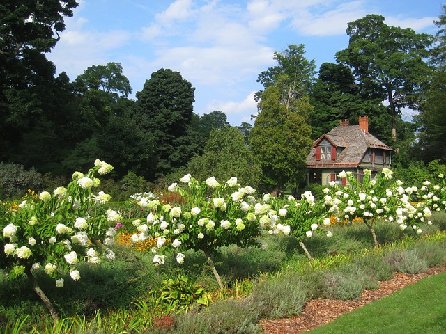
White, the other cool, calm color (which in terms of light is really a combination of all the colors in the spectrum), creates a sense of openness and space in the garden, and can make a small garden feel bigger. White also looks clean and fresh, the color symbolic of innocence and purity. Cool, bluish white flowers shimmer and sparkle in the shade and glimmer gently at dusk. Warm, creamy whites glow in dim light and add soft warmth to a garden of blue and violet flowers.
Gray is said to promote creativity, offering a blank slate upon which to let the mind play. For a garden to fire your imagination, plant lots of gray and silver-leaved plants to create a neutral background against which to dream dreams and foster the flow of ideas.
The colors from the warm part of the spectrum are the fiery attention-getters that create an entirely different mood in the landscape.
Red is the boldest and most exciting. It demands our attention, and seems to stride purposefully toward the eye across space. Red in the garden can call attention to a focal point or draw the eye away from a less-than-desirable view. This color feels warm and energizing and stimulates conversation. Red flowers surrounding a picnic table or other outdoor dining area will tend to make it seem as if the food tastes better, increasing the pleasure in an already delightful experience. Red is intensified when surrounded by its complement, green. When lightened with white, red softens into pink; with a bit of blue and gray it turns to mauves in the garden bring feelings of peace and gentleness, harmony and joy.
Yellow is the color perceived most readily by the human eye (which explains why we have yellow taxis and school buses). It too, draws attention and can be used to emphasize features in the garden and draw attention away from eyesores. Yellow is cheerful and happy, glowing rather than smoldering. Pale yellows and greenish yellows are light and bright without being hot; they bring a sense of freshness and a quality of spring to the garden. They create a feeling of quiet excitation and can help make a small garden feel bigger. Golden yellows are warmer, deeper and richer; they glow where the pale greenish yellows gleam.
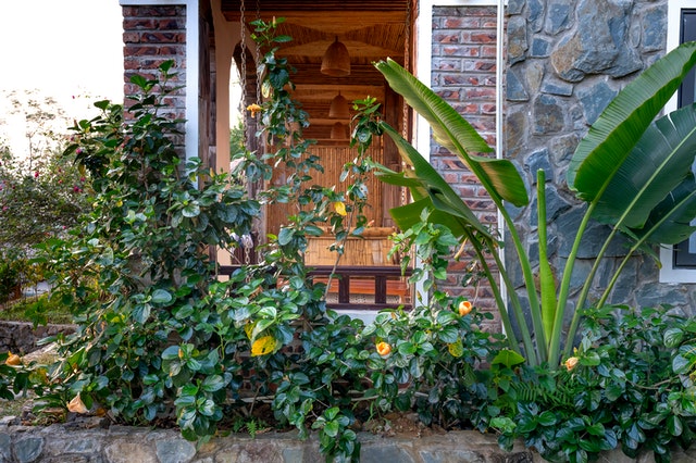
Orange is the color of impulse. In the garden, it glows warm like candle flame or the embers of a fire. Orange feels energetic and positive, and is good for emphasis in the garden. In its pastel forms- apricot, salmon, and peach tints-orange is cheerful, friendly, and welcoming and brings a pleasant feeling to the garden.
Developing a Color Scheme
There are four basic ways to work with color to build color schemes in the garden. You can rely on a single flower color contrasted against foliage: you can combine harmonious or analogous colors, or contrasting or complementary colors; or you can plant in an assortment of mixed colors.
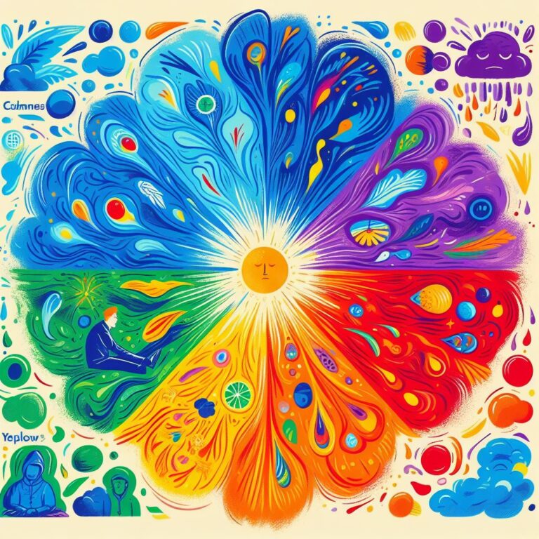
An artist’s color wheel is an invaluable guide to understanding the relationships between colors and how they work together. Refer to the illustration below as you read about the different ways to combine colors in the garden. Don’t feel that you have to be a slave to the color wheel. If you have a strong sense of color, follow your own inner light. But if you feel at a loss when you try to mix colors, the color wheel can be a useful tool.
Monochromatic Gardens
The simplest color scheme of all is built on a single color, perhaps expressed in several different shades and tints, and perhaps with a small amount of a second color added as an accent. Monochromatic gardens can be quite soothing to the eye, and their simplicity can work extremely well in a formal setting. You might like a garden of all white flowers, or red, or yellow. Or you could combine several shades of pink.
Single-color gardens need not be boring, either. You can include a variety of flower forms, plant heights, shapes and textures, flower sizes, and color values and intensities (pale, bright, or dark). Or you can mix in some plants with variegated or colored foliage for added interest.
Foliage Effects
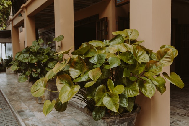
Foliage plays an important role in any garden. Flowers, especially perennials, come and go, but leaves are in place throughout the growing season. When considering plants for your garden, try to have a variety of leaf sizes, shapes, and textures. From rounded to spiky to feathery, leaves come in many forms.
You can also use foliage color in the garden to add interest and to create special effects. Here are a few points to consider about leaves.
Deep, rich green leaves are a terrific backdrop or companion for red or white flowers. Deep greens make reds pop and whites sparkle.
Grayish green or silver leaves, such as those of Artemisia, achillea, nepeta, and lamb’s ears (Stachys), act as blenders or harmonizers. You can plant them among bright-colored flowers to tone down and help blend the colors. Grayish or silvery foliage softens sharp lines and hard edges-they can give a formal garden a softer, less can give a formal garden a softer, less austere look. Gray leaves can also diffuse bright, strong light, a plus in climates where the sun is intense and glaring.
Golden leaves light up shady corners like a shaft of sunlight. In a humid, cloudy climate, golden foliage lends a warm glow. But in places where the sun is quite strong, yellow leaves can look pale and washed out.
Red and purple leaves add dramatic accents to the garden.
Variegated foliage (striped, streaked, spotted, edged, or splashed with one or more other colors) can add depth and richness to the garden, but it works best when used sparingly. Too many patterned leaves create chaos in the garden and detract from the flower colors. Use just one or two variegated plants in your composition.
Evergreen foliage contributes to the garden year-round. Be aware that evergreen foliage may look different in winter than in summer. Some evergreens, such as creeping juniper (Juniperus horizontalis) and inkberry (Ilex glabra), take on purplish tones in cold weather. Others, including littleleaf box-wood (Buxus microphylla), eastern red cedar (Juniperus virginiana), and arborvitae (Thuja occidentalis), turn bronzy or yellowish. The plants return to their usual green when the weather warms up in spring.


